
Stepwriter: Automated Publishing of Apple Health Data
One feature of my yearly sponsored walk to raise money for St. Jude is my dollar-per-mile self-donation, in which I donate $1 for every mile walked across the entirety of September, as reported by the walking distance on my Apple Watch. To provide regular updates (and to keep me honest and motivated), each year I’ve tracked progress in a Google Sheet to compare against the yearly goal, which is published on the fundraiser page. This provides me with:
- an embeddable spreadsheet with each day’s step count and distance
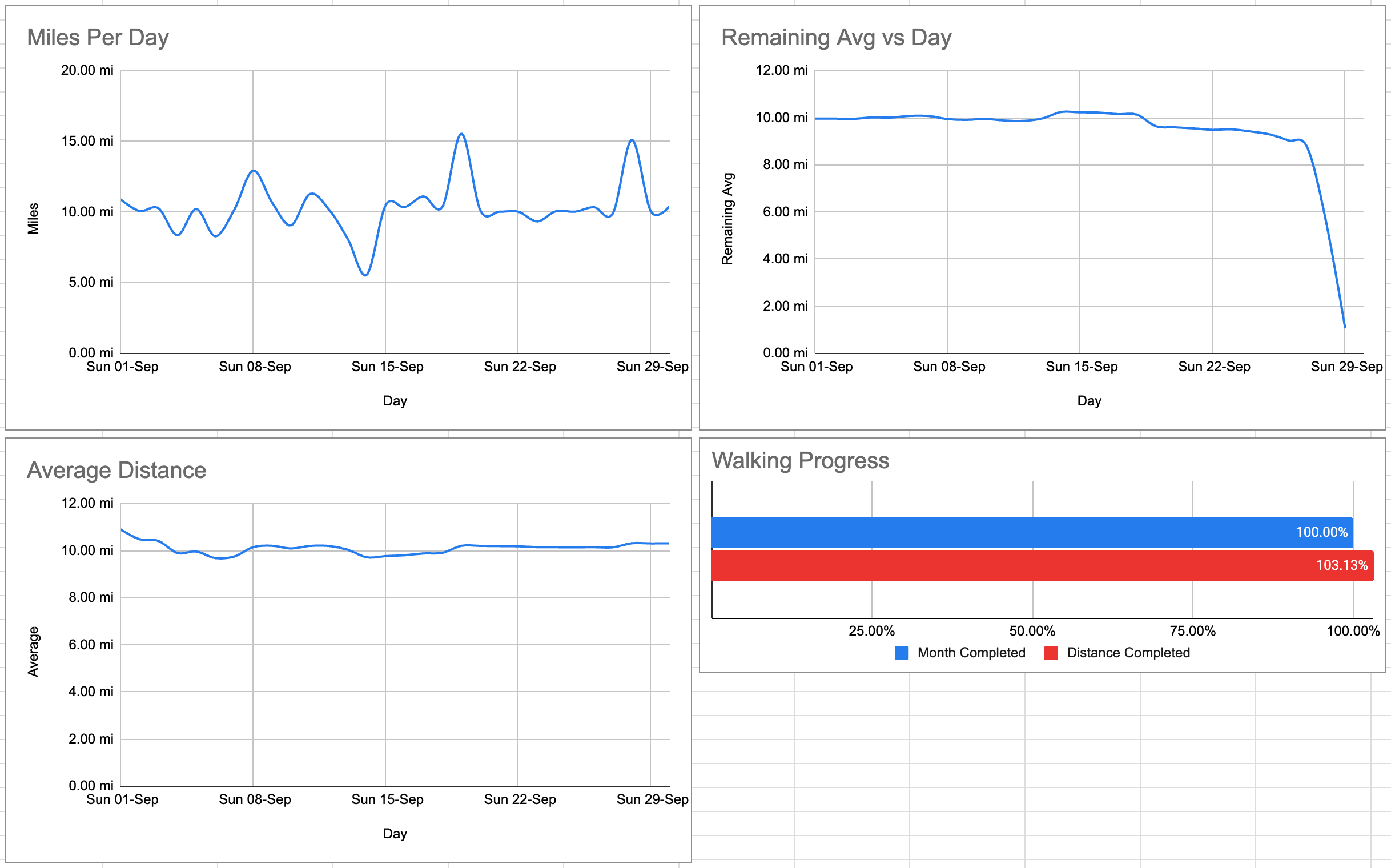
- an embeddable graph comparing distance walked to month progression1
- average distance walked for each completed (fractional) day
- average distance needed to walk each day to hit the goal
- expected final distance assuming a linear progression
Alongside the raw statistics there are a couple of graphs to help visualise this; these remain pinned in my browser throughout the month.
In 2023 the spreadsheet was filled in manually: a couple of times a day I would open the Activity app and enter that day’s numbers. This proved to be rather tedious, so in preparing for 2024 I took to automating the process. This would prove to be doubly helpful as in August I came across Pimoroni’s Inky Frame E Ink display, and decided to turn this into a physical status screen.
Step 1: Getting data from Apple Watch
The first step in automating this process was to programmatically extract the distance data from my Apple Watch and put it in some form I can use for the two purposes. Data collected by the Watch ends up in the iPhone’s Health database, so querying this is the way forward, obtaining either the raw records, or ideally a summary for each day. Thankfully an app exists for this exact purpose, Health Auto Sync.
Health Auto Sync’s key selling feature appears to be in its versatility - supporting multiple exports each which can export different data types from the Health database for differing time periods and summarisation preferences. It’s worth noting however automation is gated behind a subscription, so if using this app for any project, this cost would need taking into account.
For the purposes of this project only two pieces of data are needed, “Walking and travel distance” and “Steps”, so these are set as the data to export, grouped by day and exported to JSON. The end result of is a file that looks like the following2:
{
  "data" : {
    "metrics" : [
      {
        "units" : "mi",
        "name" : "walking_running_distance",
        "data" : [
          {
            "qty" : 10.933225690335604,
            "source" : "Simon’s Apple Watch Ultra 2|SiProMax",
            "date" : "2024-09-01 00:00:00 +0200"
          },
          //...
        ]
      },
      {
        "data" : [
          {
            "source" : "Simon’s Apple Watch Ultra 2|SiProMax",
            "date" : "2024-09-01 00:00:00 +0200",
            "qty" : 23870.427202365652
          },
          //...
        ],
        "name" : "step_count",
        "units" : "count"
      }
    ]
  }
}
This was scheduled to run on an hourly basis, and upload the result to Dropbox3, from where a server can download it for further processing.
When first testing this setup, I found it useful to enable notifications which appear when the automation is triggered so I can tell when I should expect data updates. There is similarly a Home Screen widget which shows the latest sync status, which the documentation suggests can help make sure the automation triggers, but with my experience it’s not clear if that is actually the case.
Step 2: Update Google Sheets
With the data in a usable form, the next step is to update the spreadsheet, and this is achieved using the Google Sheets API. The file from Step 1 is loaded, with each day compared to its last known values. If these two values differ, an update of the relevant cells are added to a queue. Once all days are processed, if the queue is not empty, one final change is added to set the last updated cell to the input file’s modified time, and the batchUpdate API is called to update the entire sheet.
Taking this approach has two advantages. Firstly, I wanted the ability to manually edit the spreadsheet in case something went wrong with an update, and not have to fight the update script afterwards. By comparing against the last update the script issued rather than the current cells contents I maintain this ability4. Secondly, by only pushing updates when they actually exist I avoid any issues of hitting any API rate limits if the script is called a lot when the rate of actual updates is far lower.
This is scheduled to run as a cron job once every 15 minutes. It’s more frequent than the underlying data updates, but minimises the time the sheet is out of sync with known data given there’s no fixed time when updates from the phone arrive.
The final version of this script, which has been dubbed Stepwriter is available on GitHub. It is driven by a config file which holds API keys, Spreadsheet IDs and cell references for where to add data. I have tried to centralise details specific to my use case (the input JSON format) so it shouldn’t be too difficult to repurpose this for other needs.
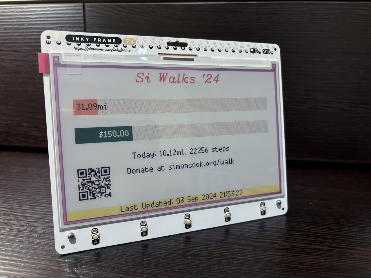
Step 3: E Ink Display
As noted earlier, one addition for this fundraiser was an E Ink screen that would show the current status, acting as a physical version of the analysis graphs above, but with the addition of also reporting how much money was raised so far. Throughout the month, I would take the display with me and it made a good introduction for what I was aiming to achieve.
First some technical details on the device itself: the display is a 7-colour, 800x480 E Ink display controlled by a Raspberry Pi Pico W (my version pre-dates the Pico 2 W variant). When travelling it is powered by a 400mAh battery velcro taped to the back of the display, and during development it is powered directly from the USB bus. Once data is loaded, updating the screen takes just under a minute.
The board comes preloaded with MicroPython, and a demonstration pre-loaded that uses the buttons to choose between a set of five apps. This heavily uses a graphics library developed for this purpose called PicoGraphics (I had this open throughout as a reference). Generally, as well as the nice design and build quality, I have been very impressed with Pimoroni’s documentation; a good reference for the board is their getting started tutorial which is available here.
This was my first foray into MicroPython, so having downloaded the recommended editor Thonny, I took a look at InkyLauncher and its apps sources to understand the framework and find a good starting point for my work. I would then create and substitute in for one of the apps, making use of what support code already existed. The main launcher menu itself particular helped since its design most closely resembled progress bars, so I went on sketching out the design, following this three step process:
- Using placeholder values, get the interface to look how I wanted
- Write a script for my server to provide real data
- Have the board’s
update()function download that file and replace the placeholder values
This approach worked well; I knew most of my development time would be spent drawing the layout that I wanted, and this would ultimately dictate what information would be needed from the server. As an example, since the server is a far less resource constrained environment than the board itself, features such as date and number formatting were done server-side, leaving the board’s program to mostly draw rectanges and render strings. One key exception however was progress bars and text aligning which was done client side. In the end I settled on providing an input that looked like the following:
{"current": "995.00", "goal": "600", "updated": "01 Oct 2024 07:04:42", "time_progress": 100, "total": {"dist": 309.38, "step": 679114}, "today": {"dist": 10.44, "step": 22883}}
This file gets generated on the server in a manner somewhat similar to Stepwriter, but with all the Google components removed and a call to the Tiltify API to get the current raised and goal amount, and placed on a web server where the board can access it. Here I would like to thank Zoe Knox for her wonderful Scriptable widget for details on the API, as well for the widget really being the inspiration for building a visual display in the first place!
Throughout the month a third progress bar was added to track the month’s progression, recreating the comparison shown in the graphs earlier. The final version can be found in the stepwriter-display repository. It isn’t as configurable as the upload code, but I think it makes for a good demonstration of building a modular interface on the Inky Frame.
Step 4: Future Enhancements
Moving to a fully automated system was a massive improvement over what I had done in 2023, and it’s given me thoughts on how this can be streamlined further. In particular rather than running part on phone, part on server and relying on Dropbox/iCloud Drive as a sync point, the entire process could be driven by the phone.
In recent years the Apple Shortcuts system has advanced sufficiently that I think this would provide the most immediate and reliable execution of this system. What I am imagining is having a Shortcut run each hour that queries the Health database directly, and pass this data to either a local Python script (using something like Pythonista), or a script on the server (using Shortcut’s built-in SSH action).
For the display I plan to completely rearchitect how this works and make it more generic. Now that I’m familiar with the PicoGraphics library that drives it, I want to move to a model where the display instead downloads a remote layout description from the server that when evaluated would produce the final output. This would allow me to iterate on the layout without being tethered to Thonny, and give me a framework to have the screen display a wider range of things just by updating the remote config.
Both of these enhancements feel large enough that really they’re separate projects in their own right. As such, when these happen, I will similarly document them here.
-
This is calculated based on the last updated time, which creates an interesting situation: at the start of each day it shows that I’m behind schedule (since I haven’t been sleepwalking), but by the end of the day it balances out. A future version could potentially model this. ↩
-
It’s not entirely clear why steps are floats, but I’m just ignoring the fractional part. ↩
-
A first version of this was set to store the output to iCloud Drive, but I generally found uploading to Dropbox more reliable. I suspect that’s due to the nature of Apple’s managing when to sync based on network and battery conditions, but didn’t investigate further. ↩
-
As it would turn out, this functionality was never needed, but when iterating on the whole system a manual override even for debugging is useful. ↩